Red Letter Day: A British Keycap Palette That Works at 5pm
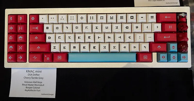
Photo: Patrick Breen, CC BY 2.0, via Wikimedia Commons
British colour is rarely one thing. A post box is loud, a National Trust sign is calm, and a seaside kiosk can be faintly radioactive. That is good news for keyboard builders. You do not need a Union Jack spacebar or a tiny corgi on the Esc key to make a board feel local. You need a palette that behaves like the places you actually see on a normal Tuesday.
This is part design essay, part buying guide. The aim is a coherent, British-inspired colourway that survives ISO-UK legends, real desk lighting and the bit where you have to use the thing for work.
Start with references, not a theme park
The strongest British palettes come from ordinary objects rather than obvious symbols. Post-box red is a functional warning colour that happens to look excellent on a small accent key. Heritage green is the colour of painted railings, visitor-centre signs and the sort of tea room where the scones are serious. Seaside pastels are faded by salt and sunlight, which makes them more forgiving on a keyboard than pure candy colours. Road-sign yellow is a high-visibility hit that should be used like chilli: a little goes a long way.
Pick two references, not five. A board with red, green, blue, yellow and cream can end up looking like a jumble sale in a good way only if you are very lucky. A board with a calm base, one supporting colour and one loud accent will look deliberate every time.
Four references that hold up
Post-box red works best as an accent. Put it on Esc, Enter or a couple of arrow keys and it gives the board a pulse without shouting over your screen. On a full red case or a full red modifier set, it can start to feel like a fire alarm.
Heritage green is a natural modifier colour because it is dark enough to anchor a layout. Deep green with cream legends feels British without being costume-y. A brighter sage or mint is friendlier, but check it against your legends; pale green with white legends can disappear under a warm lamp.
Seaside pastels are ideal for base kits. Think faded deckchair blue, chalky pink and soft cream rather than neon ice-cream shades. They look lovely in renders and slightly greyer in real life, which is usually fine. Just do not expect the saturation you see on a backlit monitor.
Road-sign yellow is the best small accent in the box. A yellow Enter or a yellow novelty key can lift an otherwise sober board. Use it once or twice, not on every modifier, unless your goal is a keyboard that can be seen from the next street.
ISO-UK changes the colour maths
ISO-UK layouts are not just ANSI with a big Enter. The tall Enter, short left Shift and extra legends around AltGr change where your eye lands. A bright accent on the Enter key is much more dominant on ISO-UK than on a compact ANSI board because that key is physically larger. If you want a quieter look, put the loud colour on Esc or a cluster of navigation keys instead.
Compatibility is the boring part that saves you money. Check that the keycap set actually includes ISO-UK legends, not just an ISO Enter. You need the right Shift, the correct AltGr labels and the number-row legends you expect. If a group buy is running in late 2026, read the kit renders carefully and look for a UK-friendly vendor or a kit that explicitly covers your layout.
Screen colour is a polite fiction
Every keycap render is an opinion. Your monitor is probably too bright, your room is probably warmer than the studio used for the photos, and the production plastic may be a shade or two off the sample. That is normal. The trick is to buy from vendors who show real photographs alongside renders, and to look for colour references in the photos, such as a white sheet of paper or a desk mat you recognise.
If you are choosing between two similar shades, go for the one with more contrast between legends and keycaps. Contrast is what makes a board readable at a glance, and it matters more than hitting an exact heritage green. A slightly darker modifier with cream legends will usually age better than a perfect colour match with muddy text.
Ratios beat themes
A reliable formula for a British-inspired board is roughly 60/30/10: a neutral base, a supporting modifier colour and a small accent. That could be charcoal base, deep green modifiers, post-box red Esc and Enter, and cream legends. Or off-white base, faded seaside blue modifiers, road-sign yellow accent and dark legends.
Warm and cool colours need a referee. Cream legends warm up a cool blue board; bright white legends make a heritage green look sharper and more modern. If you are using pastels, keep the legends dark or cream rather than pure white. If you are using deep greens and reds, cream legends usually feel more at home than icy white.
The 5pm test
British desk lighting is not a constant. In November, your keyboard may be lit by a warm lamp at 5pm and a cool monitor for the rest of the evening. Before you commit to a set, look at real photos under warm light and cool light. If your lovely pastel palette turns to grey mush under a 2700K bulb, it may still be fine, but you should know that before it arrives.
A simple test is to put a colour sample next to your actual desk mat, case and monitor bezel. If the palette looks coherent next to those three things, it will probably work in the room. If it only looks good against a white background, it is a render, not a keyboard.
Buying without the novelty tax
British-inspired does not have to mean limited-edition. A good base kit in a sensible colourway will outlast a novelty set with twelve custom novelties you never use. Spend your budget on ISO-UK compatibility, decent legend quality and a material you actually like typing on. Extras are fine, but buy them because they solve a colour problem, not because they come in a nice box.
Finally, remember that a keyboard is a tool that lives on a desk. The best British palette is not the one that looks most like a postcard. It is the one that still makes you smile when you sit down to answer emails at 5pm on a wet Tuesday.